Chameleon Website Design Principles
Around 71% of small businesses have a website. A website’s importance is understated in today’s highly globalized get-it-fast world.
If you own a brand or any kind of business, then it’s a requirement for you to create a website — something for your audience to run to when they need more online information about your brand or your products.
Thus, we need to understand the ingredients that make up a coherent and beautiful website that exudes who you are as a business. Aside from that, we need to get your website to work on different mediums like desktops and phones.
Let’s peek at the chameleon website design principles you need to know to stay relevant online.
Website, Explained
If a library is to store books, music, photos, etc., then a website is for a business. It’s a digital catalog that defines what a company is every step of the way.
It’s also akin to an application that updates itself when new features exist. A website has everything you need to know about a business, from the products produced to how they got established.
And when designed in a particular manner, the website targets a specific market to convince them to buy their products.
Thus, let’s get into the elements of a website you have to add.
Chameleon Website Design Principles
When creating a website, remember these factors that make up its existence. Let us introduce the 14 elements that make a website efficient.
- Get Inside the Mind of Your Customers
- Be Purposive
- Understanding of Visual Hierarchy
- Color Scheme is Key
- Beauty in Simplicity
- Pair With Divine Proportions
- Utilize Negative Space
- Get to Know Fitt and Hick’s Laws
- Grids Are Your Friend
- Don’t Forget Content Creation
- Take Into Account Loading Time
- Don’t Forget to Troubleshoot
- User-Friendly
- Think About Multi-Platform
1. Get Inside the Mind of Your Customers
When creating your website, you need to understand that you are making that for your market. So you need your market’s opinions and gain their trust.
You need to look credible and have quality content. In line with that, the go-to choice for users is satisfaction—meaning that they’d choose the first option about anything they want or need.
Aside from that, since users mostly scan a page, it’s vital to divide your content into an easily digestible format.
Now you know your customers’ behaviors, let’s get into the website’s purpose.
2. Be Purposive
Ask yourself why you want to build a website. Is it because you want to communicate with your customers, educate them, or make some sales?
Whichever it is, make sure that you establish the purpose of your site. Pinpoint the motivation for creating the website and execute it. Some significant reasons you may have are (Beekreatif):
- To Do Business – For transactions between you and customers
- To Communicate – For Sending and Receiving Messages
- To Educate – For Aiding The Learning Process
- To Entertain – For Leisure Activities
When you look at that list, you can have all reasons simultaneously or two or three. Just remember that it’s okay to have one too. Now let’s get into the visuals.
3. Understanding of Visual Hierarchy
In design, visual hierarchy is essential since it tackles the organization of elements in a design. Everything from placement, color, typography, and such are under this topic.
Visual hierarchy aids in directing the eyes of your visitors to the aspect of your website that you want them to see. For example, you want them to focus on creating a logo.
Like our website above, our logo maker is the front and center of our website. Our typography, paired with our distinct color scheme, makes everything well-rounded.
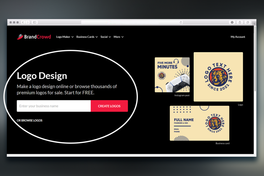
Thus, it’s the first thing you see. For you, though, you can emphasize anything you want as long as it fits your branding scheme. Moving on, let’s discuss the color palette.
4. Color Scheme is Key
Having a distinct color palette for your business is a part of the visual hierarchy. According to Oberlo, around 80% of consumers recognize you more if you have a specific color as a business.
If you are having a hard time deciding, try looking into some theories like:
- Color Psychology – Explanation of how color affects the mood of people.
- Color Wheel – Explanation of different colors according to their placement on the wheel.
- Hex Color Code – Numerical value of colors as seen on the web.
- Gradients – Combining two colors or more of the same or different shade.
You can choose any of these. You don’t have to try and incorporate all of the theories.
5. Beauty in Simplicity
Going back to user behavior, your visitors do not want anything complicated. We repeat, nothing complicated.
Thus, make that reflect in the layout of your design. Make sure that your website is easy to comprehend. The test of an effective, simple design is that people understand your website with one glance.
We’ll use our website as an example again.
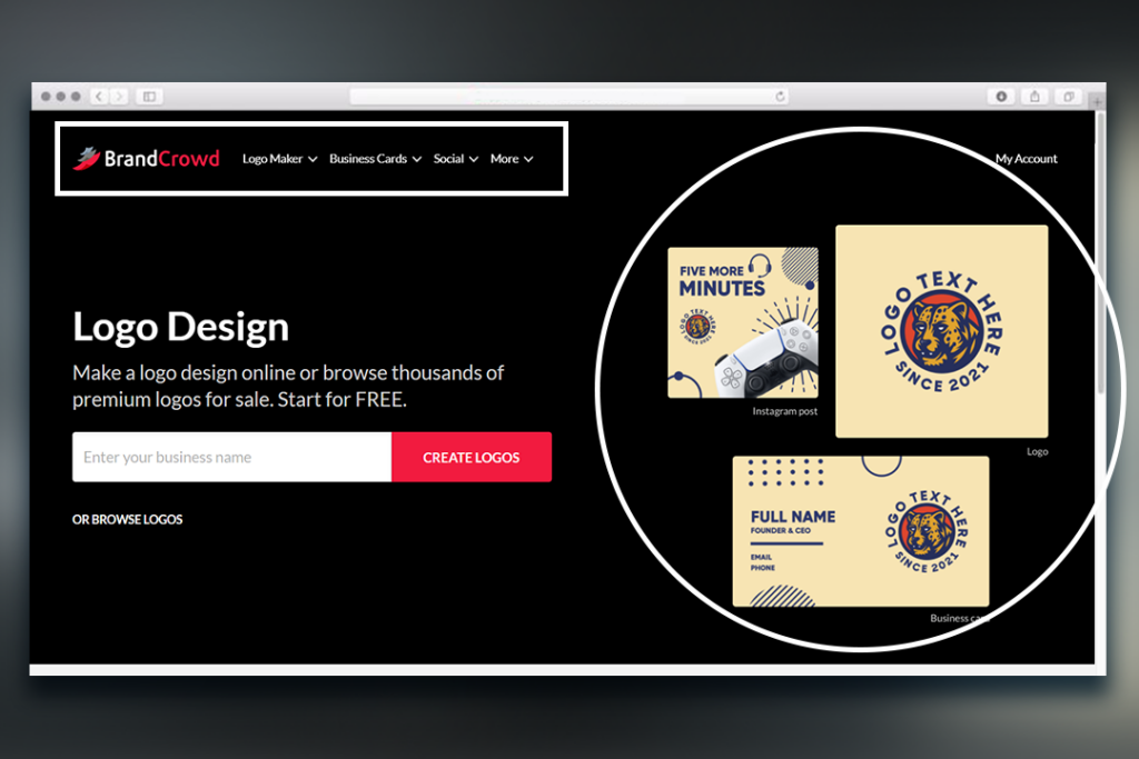
On our landing page, you can see what services we offer: logo maker and any DIY designs you need for your platform. Aside from that, we have a visual that shows you the possible outcomes of availing of our services.
6. Pair With Divine Proportions
This portion is a bit technical but stick with us. The divine proportion or golden ratio is a set of numbers: 1.618, approximately. It’s a critical set that’s part of the Fibonacci sequence since it appears everywhere, and we mean everywhere.
From plants to trees to inanimate objects, align the diagram, and it’ll look like a perfect fit. Take a look below at our website.
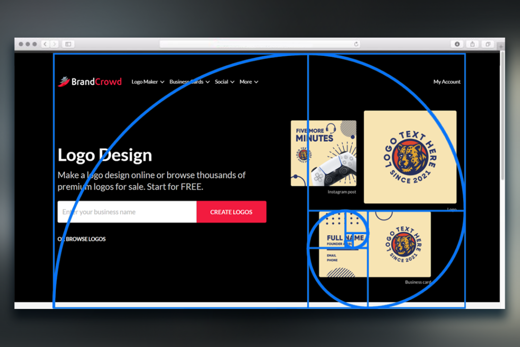
Looks like a perfect fit, right? Make sure your website fits the sequence as well. Just add the diagram to check the fit.
7. Utilize Negative Space
Having negative space emphasizes your products and services when it comes to websites. Look at our catalog of logos below.
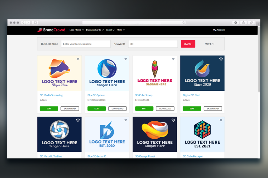
The negative space allows for a clean and emphasized look on our products. Visitors’ eyes roam the website easily as they search for their new logo.
A negative space added to website design is a must to aid in your website’s clutter-free and straightforward feel today.
8. Get to Know Fitt and Hick’s Laws
Now, we delve into the perception of decision-making.
Fitt’s law states that users choose to use a button (when put in the website context) because of its distance and size. Thus, the bigger the size, the better, but that still depends on the placement and assigned the button’s function.
Hick’s law, on the other hand, talks about the time spent on a website. The law states that the more choices there are, the more extended the user’s stay. But with, the length of stay is equated to confusion. Thus, Hick’s law encourages eliminating choices that aren’t closely related. This law reinforces the need for simplicity in your website design.
9. Grids Are Your Friend
Grids are one of the most common methods for you to organize and neatify your website. It’s like the Rule of Thirds in Photography.
Using a grid means having elements align through the intersecting lines horizontally and vertically. IIn a way, it helps your alignment look more symmetrical and clean cut.
10. Don’t Forget Content Creation
You may have finalized your design and layout, but don’t forget your content. Aside from your products and services, it’s great to add more personality to your brand.
A Get-To-Know page for team members or companies is a great way to beef up your website. Or if you want to add a history of the company, that’s great too.
But aside from all that, try to add a blog section to your website to target your market better. It also allows more traffic flow to come your way.
Content Creation in the form of a blog allows you to utilize SEO techniques that make you appear in the google search bar. The higher the ranking of your content, the more people would come to your website and see your products and services.
11. Take Into Account Loading Time
A part of increasing user engagement is how fast your website would load. Of course, other factors affect loading time, but the slower it loads, the higher the dip in sales.
But it also depends on which platform you’re on. For example, Google observed a 20% dip in traffic and revenue while Amazon observed a 1% decline with a 1ms delay in loading time.
Check your file compression, redirections, content delivery network, and minifications to avoid such mishaps.
For file compression, no more than 200 KB is the most accepted size. Since blog posts and your landing pages need to show images, make sure their sizes aren’t too big to facilitate fast loading time.
For redirections, reduce redirecting to other servers (other admin pages). It also takes time to ask for a request to visit the page upon clicking the hyperlink.
For content delivery networks, ensuring that the content you publish is nearer to wherever your visitors are geographical aids loading time.
Lastly, for minifications, ensure that you check for unused space and remove code to make your loading time faster.
12. Don’t Forget to Troubleshoot
Is your website in order?
Ensure that you test the stability of your website now and then. You never know; a bug or a hacker might be about to steal your clients’ information.
Aside from that, the integrity of your website is at stake. The more it crashes, the more time it takes to load, decreasing traffic and revenue.
Thus, make sure that your test your website at least twice a month to ensure integrity. Maybe after adding updates, troubleshoot it, then do it again at the end of the month. It all depends on how you want to do it.
13. User-Friendly
Another great way to ensure a better user experience is to make your website user-friendly. From the buttons to the placement of products, make sure that everything seems seamless and readable.
Some tips you can follow to make your website more user-friendly:
- In-Depth Explanation of Your Product
- Add Your Contact Information
- List Type Catalog is Great
- Hyperlink Social Media Icons
- Utilize Strong CTAs
14. Think About Multi-Platform
And we finally come to our last principle for a better website. This portion is why the blog is called Chameleon Website Design Principles.
Like a chameleon that adapts to its environment, your website has to have the ability to adapt to any medium it’s viewed on: desktop, phone, tablet. Though, it’s better to do research for this last portion to work.
You know which medium to invest in a website when you do so. But here are the typical pixel count for each of the devices:
- Desktop: 1920×1080
- Mobile: 360×640
- Tablet: 768×1024
And there you have it. Just remember that before you finalize everything, do your research on which medium your market uses most to gauge your budget better.
Those Are Your Chameleon Website Design Principles
That concludes our collation of principles to aid your website design. Take note that you can prioritize them according to your needs.
Speaking of needs, we can aid you in your design endeavors whether it be logo or website. You can visit our website for more DIY design options. Upon purchasing a logo from us, our Brand Pages (website templates) will be available to you.
We’re excited to see your website online. Good luck, business owner!
